

ESPRESSO CLEANING
Brand Identity

OVERVIEW
Espresso Cleaning is a residential cleaning company built around making everyday spaces feel fresh and cared for. The brand needed an identity that felt feminine and memorable while still being professional enough to grow with the business. Inspired by the name Espresso we created a playful visual world filled with rich chocolate brown and shades of pink.
SOLUTION
Custom wordmark designed to create a bold and recognizable brand presence
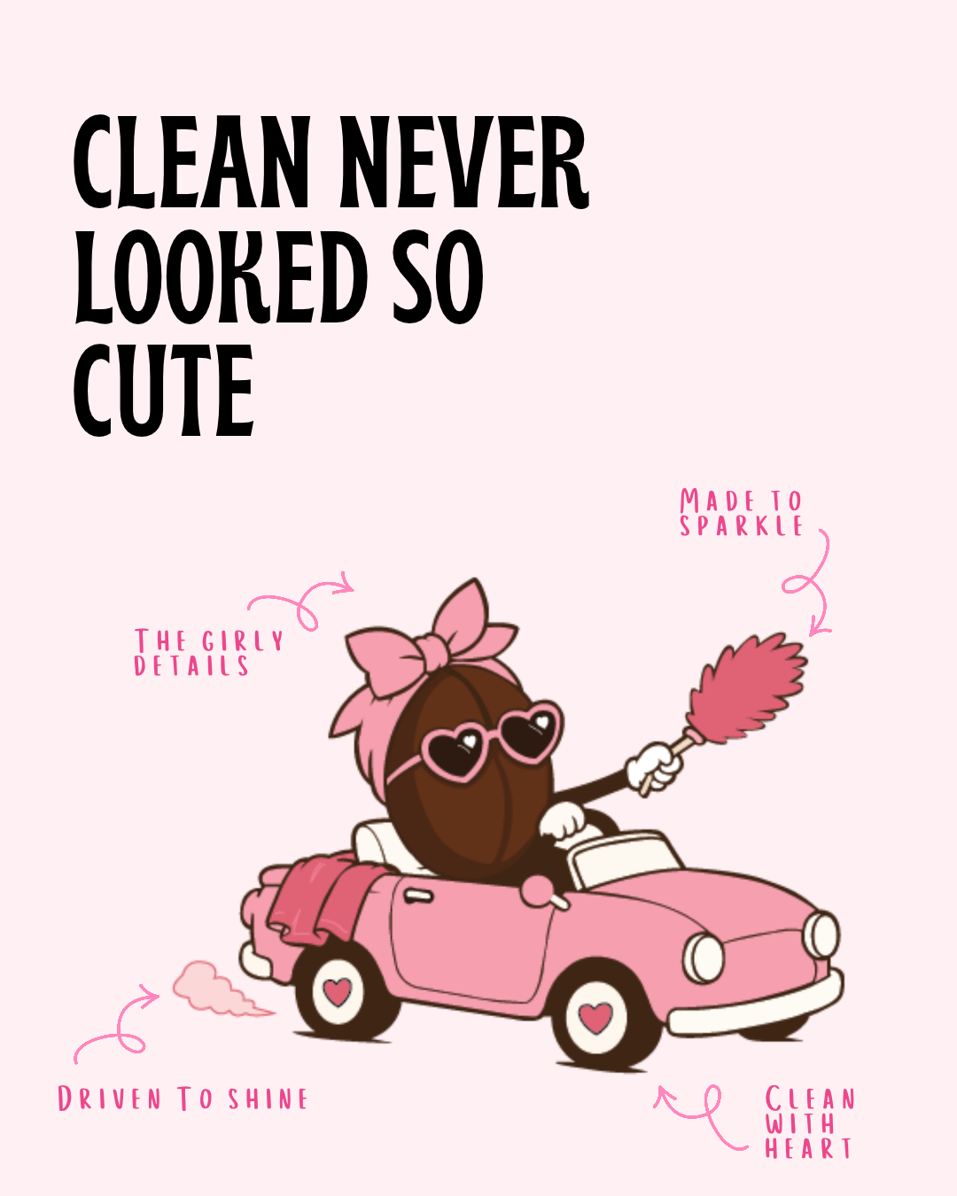
Hand drawn mascot and convertible illustration built around the personality of the brand
Feminine color palette combining playful pinks with rich espresso brown
Coordinating submark designed for flexible use across print and digital applications
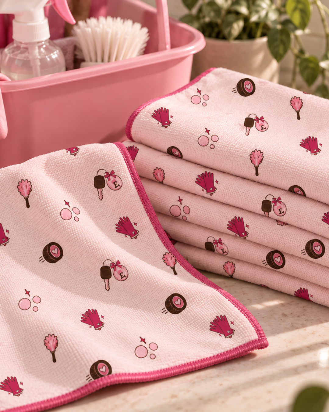
Playful icon and pattern system inspired by cleaning details and signature brand elements
Cohesive visual system designed to feel memorable, polished and full of personality
APPROACH
The goal was to create a cleaning brand that felt anything but expected. Instead of relying on traditional cleaning imagery we leaned into personality and nostalgia. A bold customized wordmark became the foundation while playful illustrations and soft feminine details gave the brand its own recognizable character.
RESULT
The final identity feels playful and polished with a personality that is completely its own. Every piece works together from the custom mascot and convertible to the bold wordmark and feminine details. The result is a brand that feels memorable at first glance and gives Espresso Cleaning plenty of room to grow.

Here, creativity meets opportunity. Whatever you're building, we're here to help you take the first step with confidence. Driven by curiosity and built on purpose, this is where bold thinking meets thoughtful execution. Let’s create something meaningful together.